
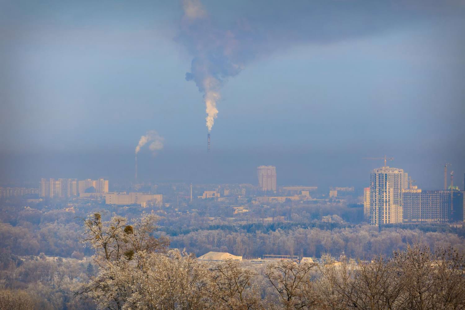
Air pollution is a growing concern in many parts of the world, impacting public health, the environment, and overall quality of life. To better understand and manage this issue, air pollution maps have become essential tools. These maps, created using data from a network of monitoring stations and sensors, provide real-time information about air quality in specific cities or regions.
By visualizing this data, air pollution maps enable governments, organizations, and individuals to make informed decisions to protect public health and the environment. This comprehensive text will explore how air pollution maps are created, the types of data they provide, and their significance in addressing air quality challenges.
Understanding Air Pollution Maps
Air pollution maps are graphical representations of air quality data collected from various monitoring stations and sensors. These maps typically display levels of key pollutants such as particulate matter (PM2.5 and PM10), nitrogen dioxide (NO2), ozone (O3), sulfur dioxide (SO2), and carbon monoxide (CO). The data is often presented in real-time, allowing users to assess the current air quality in a particular area.
The primary purpose of an air pollution map is to provide a clear and accessible way for the public and policymakers to understand the distribution and concentration of pollutants. By using color codes and numerical values, these maps make it easy to identify areas with high levels of pollution and compare them with regions where air quality is better.
How Air Pollution Maps Are Created
The creation of an air pollution map involves the collection, analysis, and visualization of data from a wide range of sources. Here’s a breakdown of the process:
Data Collection
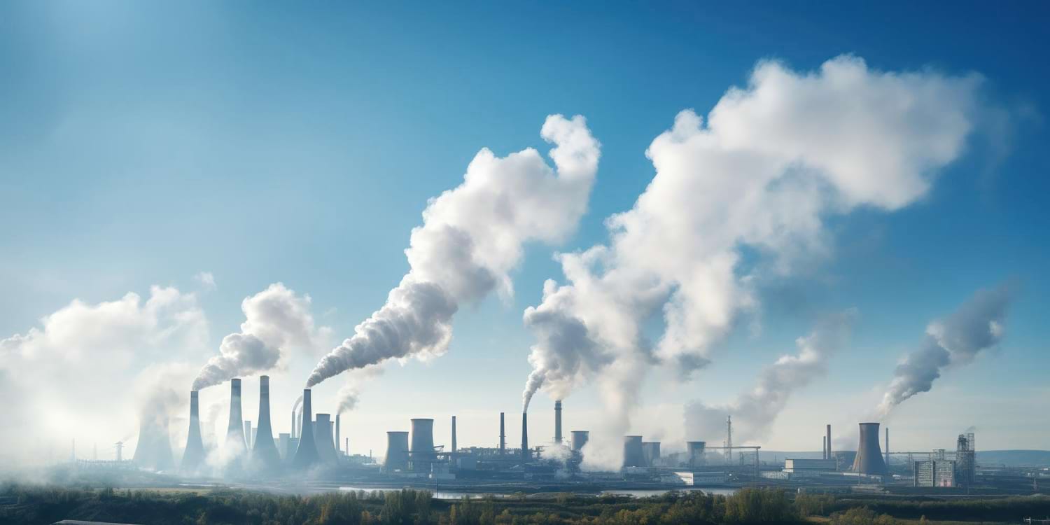
Air pollution data is collected from a network of monitoring stations and sensors distributed across a city, region, or even globally. These stations are equipped with specialized instruments that measure the concentration of various pollutants in the air. For instance, PM2.5 sensors detect fine particulate matter with a diameter of less than 2.5 micrometers, while NO2 sensors measure nitrogen dioxide levels.
The data collected from these sensors is transmitted to a central database, where it is stored and processed. In addition to ground-based stations, data can also be collected from satellite sensors, which provide valuable information on larger geographical scales and areas where ground-based monitoring is sparse.
Data Processing and Analysis
Once the data is collected, it undergoes processing and analysis to ensure accuracy and reliability. This involves calibrating the sensors, filtering out any anomalies, and validating the data against established air quality standards. Advanced algorithms are used to interpolate data from different sensors, filling in gaps and creating a comprehensive picture of air quality across a region.
The processed data is then translated into air quality indices (AQI), which are standardized measures that simplify complex air pollution data into a single value. The AQI is calculated for each pollutant, and the highest value among them is typically used to represent the overall air quality in a given location.
Visualization
The final step in creating an air pollution map is visualization. The processed data is displayed on a map using color-coded scales, with each color representing a different level of pollution. For example, green might indicate good air quality, yellow moderate, and red unhealthy. These maps can be overlaid with additional information, such as population density, traffic patterns, or weather conditions, to provide context and help interpret the data.
In addition to static maps, many air pollution maps are interactive, allowing users to zoom in on specific areas, view time-lapse animations, and access detailed information about individual monitoring stations.
While air pollution map is powerful tool, there are challenges associated with their creation and use. One of the main challenges is ensuring the accuracy and consistency of data across different monitoring stations and regions. Variations in sensor quality, calibration, and data processing methods can lead to discrepancies in the data presented on the map.
Another challenge is the coverage of monitoring networks. In some parts of the world, particularly in developing countries or rural areas, the number of monitoring stations is limited, leading to gaps in the data. Satellite monitoring can help fill these gaps, but it may not always provide the same level of detail as ground-based sensors.